|
|
 |
|
"The Labyrinth" Added on: Sat Aug 12 2000 |
| Page: 1 2 3 4 5 |
On top of the texture pass is an adjustment layer which saturates everything a little more, and the aforementioned single pass render, blended in at 50% opacity. Which I guess makes everything below it 50% irrelevant, but oh well. And to top off the lighting, I painted in some gradated black shadowing in the narrowest spaces between the arches, which would be struck by very little sky or bounce light.
Next come the two atmosphere passes. First is the "sunbeam" pass, set to "normal" mode, which is colored Photoshop to match the sun light and adds a warm haze over the upper, more exposed arches. The second atmosphere layer, set to "color" mode, uses a blue color masked with the simple fog pass to make the more distant areches more blue. I applied a bit more blue fading than would really be found in nature over the distance in my scene, but I wanted to emphasize the depth of the receding arches.
Artistic license, right?
Further up we finally come across the Crete background image, masked with an alpha of the arch geometry. By painting into this layer mask, I was able to easily modify the edge profiles of my arches to simulate rough stone blocks, getting muh of the effect I was going for with the displacement mapping test in much less time and with more control. Wouldn't work for an animation, but for a still it's not a bad trick.
In the end, I flattened all of the previously mentioned layers and did some smudging and cloning to warp stone edges and corners visible within the profile, yielding the layer called "flattened and tweaked". To top it off, I added a glare effect by adding on a couple of blurred copies of the final image, both layers set to "color dodge" and masked so as to not blow out the highlights.
Oh yeah, and I also did one last levels adjustment, just to play up the overall darks and lights of the image.
So that's it, tedious to the last but with many subtle factors adding into the finished product. Thanks for reading if you've made it all the way down here, and good luck with your own work.
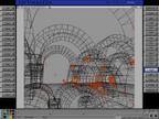
The final image is shown below as a wireframe and full rendered.
|
 |
|
|


