|
|
 |
|
"Lighter Than Air" Added on: Mon Mar 15 1999 |
| Page: 1 2 |
In deciding what to make for the Lighter than Air contest, I realized the first thing
that I wanted to do was make the image look huge and important. I quickly decided that in order to do that, I needed the right kind of mood, and an early photograph of the construction of the USS Macon was the right direction I needed to get started.
I like the odd things that old film does with color and lighting and I wanted to transfer that directly to the final rendered image. The most dominant thing in the image is the Macon itself, so this proved the most pivotal element in contstruction.
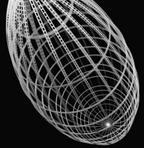
First I used lofts to define the shape and a simple, double faced, opacity mapped white texture to give it the look of more minute construction. The opacity map was a 5x5 b/w texture with a U shape describing the area to render. This was repeated hundreds of times. For the cross-sections, I used tubes with similar textures, except on the opacity, I used a 30x30 texture that was white with a black hole in the center.
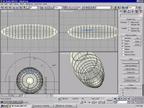
This gave the frame the exact look I wanted, except that it was lacking the odd glow around the frame. To solve this, I used a second UVW map on channel 2 of the cross sections and lofts. Channel 1 was the inherent UV and channel 2 was planar and from the top down.
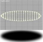
I then applied a self-illumination map utilizing the the second channel to the frame. Here is the self illumation map in relation to a top view of the airship.
This was the most important step and confirmed that I could achieve the subleties of an old photo.
|
 |
|
|


