LETS THINK DIFFERENTLY!
This is a pretty simple and yet very effective way to ink your cell shaded renders. I found this technique to be very fast and the quality of the inking at times will out do the inking in your standard ink and paint shaders.
There are drawbacks to this method and i will illustrate them later on in this tutorial but for now lets look at how its accomplished.
In order for this technique to work, we need to render in layers. I use Softimage XSI these days and find it to be one hell of a 3d program that simply excells at animation and rendering. Personally i prefer XSI's Toon shader to this method but this method does at times give a slightly better look but more on that later.
This technique can be used in any software package that has an incidence shader (fall off shader in 3dsmax terms) It also helps that you have a cell shader such as ink and paint in 3D Studio Max, or Softimage XSI's incredible Toon Shader.
HERE IS HOW YOU DO IT... PAY ATTENTION!
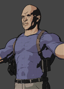
You will have two render passes that will be combined in post. Below are the two render passes.
 |
 |
|
Falloff Shader Pass
|
Toon Paint Pass
|
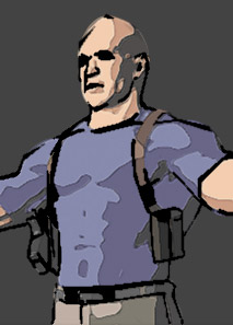
THE TOON PAINT PASS
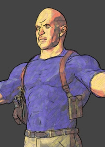
The Toon Paint pass is pretty straight forward. Apply your cell shaded materials to your object or character as you normally would. Just be sure to turn off any inking features in your package's toon shader. Then render out the pass to a .tga
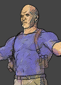
THE FALLOFF SHADER PASS
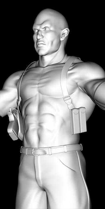
The Falloff shader pass is created by applying a constant material (that is to say a material that will be self illuminated and not effected by the scenes lighting) and then apply a falloff map(incidence shader in XSI terms) to the shaders diffuse/color slot.
When you render out the Falloff shader pass, it is very important that you render atleast 2x the size of your target resolution. This is important because after you run the photoshop toon process on the falloff shader pass, you will be scaling down the image to match the resolution of the Toon Paint Pass. Basically its a sampling issue. When you run the process in Photoshop you will be scaling down the image, which illiminates or minimizes the aliasing of the inked lines. So you are in effect super sampling the ink layer. You may want to render 3x the target resolution, its up to you to decide, as it will effect the quality of your inked lines. The rule i use is.. atleast 2x.
THE PHOTOSHOP TOON PROCESS
Now you will need to process the Falloff Shader Pass image in Photoshop in order to create the inked line art layer that will be composited over the Toon Paint Pass.
This process is pretty straight forward and while the settings mentioned below will generally work in all situations, its a good idea to tweak them for your specific situation. But dont worry, any tweaks will only be very slight changes to the number values.
The process of filters are listed and described below in the order they should be applied
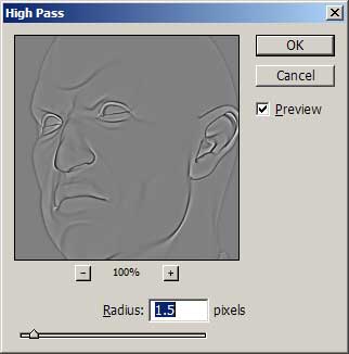
Step 1 - High Pass
- High Pass is located under Filters/Other. You will want to set a radius value of 1.5 but remember this value can be tweaked. Tweak this value if you do not like the edges being picked up by the ink process.
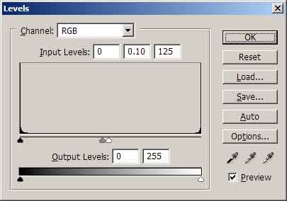
Step 2 - Levels
- Levels should be a very familiar tool to you, but if it isnt.... i suggest you get to know it :) The values you want to enter here are the "input levels" enter from Left to Right, 0, 0.10, 125.
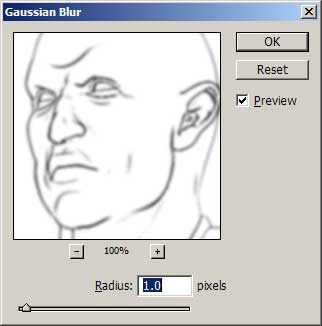
Step 3 - Gaussian Blur
- Gaussian Blur will add some thickness to the linked outines, but mainly its to filter the outlines before scaling them. This will take care of any jagged
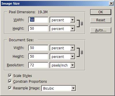
Step 4 - Image Scale
- Image Size will be used to scale the Fallof Shader Pass image (which should really be called the Inked Layer at this point) down by 50% if you've rendered twice the resolution of your target resolution.
End of Process.
It is that simple, and you can simplify your workload by creating a Photoshop action that automatically runs these commands. If you're using this technique on an animation, you can use Photoshop's batch process to process a sequence of tga frames and then finally composite them in your favorite compositing program. Mine happens to be Digital Fusion. (PLUG!) ;)
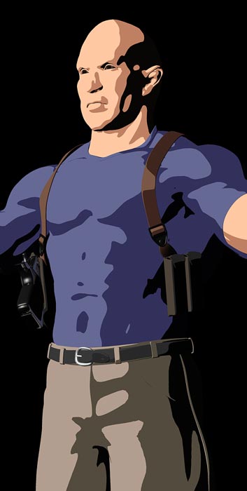
PUT IT ALL TOGETHER AND MAKE PRETTY SHIT!
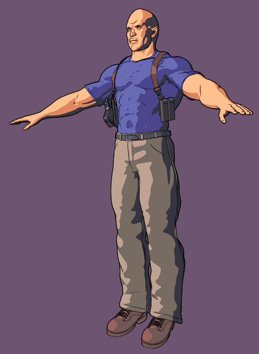
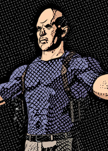
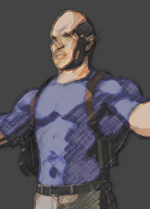
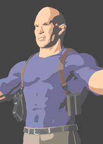
Let's look at the final result one more time. Have a look at the image below.
You may have noticed that the paint (not the ink) in the image below is slightly different in terms of color and brightness than the Toon Paint Pass image. This is because i have color corrected the Toon Paint Pass to something that is more pleasing to the eye but more importantly to the surroundings of the character. hat i'm getting at is... This is the benefit of rendering in layers. Most pro's are well aware of the benefits of rendering in passes or layers (same thing) so i will only talk about it in relation to this tutorial but know that rendering in layers provides you with a lot of control and often rendering in layers will solve problems such as lighting, color, effects etc. The benefit is amazing and perhaps i'll write a tutorial on it some other day.
For now... Note that i've changed the color using common color correction tools such as color curves and hue/saturation in Photoshop. This brought out a little lightness to some of the darker areas of the face and tinted it to match the background. If you do ever get into compositing and rendering with layers... These techniques are very common and save hours of work. Sometimes its not best to try and light everything perfectly in 3d.. but to use the color tools you have in post to make your image more appropriate for the overall composition.
Rendering your toon shaded renders in layers is good even if you are not using this Photoshop process. If you have a shader in your 3d application/renderer that allows you to sperate the ink from the paint into layers... you will be much better off when you compose your shots. Just to make a point, if you had not rendered in layers and tried to do color correction... you may brighten the inked lines, or tint them incorrectly. This way, with rendered passes, you can layer the ink over the paint and adjust the paint with color correction tools without altering the inked lines.
Ok, enough about that. Lets composite the two layers together...
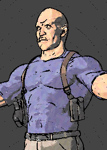
 |
 |
|
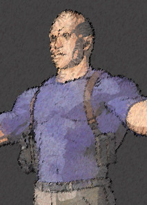
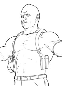
Cropped image of the final inked line layer
|
Cropped image of the Toon Paint Layer
|
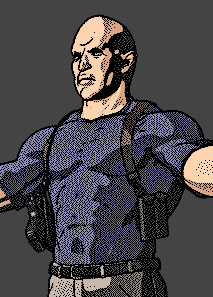
To composite the inked lines over the paint, simply multiply the ink layer on top of the paint layer using either photoshop or for animations, a post compositing software such as Digital Fusion, Discreet Combusion, or Adobe After FX..
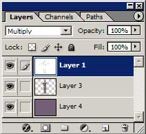
Example of Layer Order
And thats it. You've completed the process. Btw if you want darker inked lines, you can duplicate the inked lines layer and mulitply it on top your layers.
TIME FOR SOME ACTION!
I had mentioned that you can create a Photoshop Action to make this process automated and simple. Here is my Photoshop action file for the "PStoon" Technique described in this tutorial.
Click here for the PStoonAction
I suggest you play with the settings to learn how each filter works and what it accomplishes. This way you can correct any mistakes or dislikes about the result and better adapt this technique to your situation or style.
ITS FUCKING BROKEN YOU DUMB ASS... NOW WHAT?!
Calm down :) As i stated earlier in this tutorial, this method has a limitation.
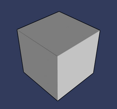
This cube represents the limiation of this method.
This technique has problems with planar surfaces. The cube is made up of planar polygons that join at 90 degree angles. As you can see the inking lines on the inside of the cube are too thin and even non existant. This is not acceptable. Most toon shaders have ways to deal with this. However as stated before, the Photoshop technique has some advantages at times because it can look really nice and even pick up edges that toon shaders miss.
Its best to avoid using planar surfaces. Its recommended you use this technique on rounded objects, objects that have lots of polygons such as subdivision surface objects or nurbs.
It at first looks like a serious limiation, and perhaps it is... But this process is only a tool in your toolbox. Use it wisely and its effective. Again, this process has its benefits... it will often pick up better edges and lines in characters than toon shaders. Its also less tempermental at times, and pretty fast to use.
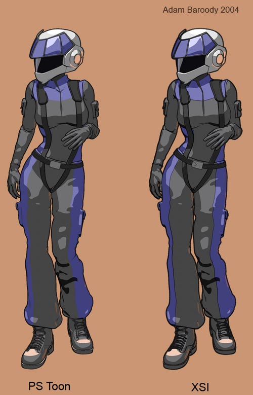
The above picture is a comparison between the Photoshop technique and Softimage XSI's incredible Toon shaders. The XSI toon shaders have lots of options and balancing them is a juggling act that often results in atleast something you dont want happening. Thats not to say XSI's toon shaders are bad, not at all. They are fantastic but sometimes balancing all of its very powerful functions can result in you missing an edge that you want. In this example, that edge is the colar bone.
The colar bones are inked properly on the PS Toon image (Photoshop toon technique) where as XSI's Ink shader has missed the colar bone. XSI has several options for edge detection and thickess but its a balancing act that may mess up other elements of your inking. The real solution would be for me to model the colar bones a little sharper in XSI so that the Toon shader in XSI picks it up easier. However thats not the point of this comparison.
The point is that the Photoshop technique has its advantages as well as disadvantages and you have now have a new tool in your toolbox to consider.
USE THAT CREATIVE BRAIN OF YOURS TO MAKE SHIT!
The great thing about rendering in layers is that it gives you freedom. Now that we have our Inked and our Paint layers we can leave it as is or we can push our own imagination and create a new style or new look. With layers we have the freedom to use image processing tools to create some very stylized images. Here is an example of some.
As you can see, many styles can be acheived by just using your imagination. There are so many great effects out there to play with.
As of late i've become very interested in non photorealistic renderings because so many folks try to acheive a photoreal look and yet there is so many interesting processing effects we can do to our images that creates a new look, a style thats never been seen.
Everyone wants that Global Illumination/Ambient Occlusion/Subscattered/Photoreal style and it all looks the same. I love to do photoreal work (even though its as frustrating as getting kicked in the balls by a pissed off donkey) but i also like this approach to toon rendering or more natural media rendering because it gives you some freedom to make mistakes and still create somethign rather unique and beautiful. Imagine the character in this example in a fight scene with one of the "styles" pictured above. Think of him in motion, what kind of look would it have and would it be new and eye catching. I'm betting it would look pretty fucking cool. So try new things with these tools and perhaps give your photoreal perfectionist side a vacation and enjoy a more liberal and free way of working. Although thats not to say its easy... it never is :)
-Written by Adam Baroody 2004 - www.3dluvr.com/rogueldr
|